Projects: A closer look at our approach
A dive into the process and strategy behind our work and the results we achieve for our clients though strategic branding, digital marketing, and UX/UI design.
Port of Portland’s new brand centers on confluence: the coming together of two rivers and many people, working together toward a vision of shared prosperity.
With pre-curated gift sets and personalized custom gifting, Cette’s mission is to spark connection and turn daily life into an act of art, full of beauty and delight.
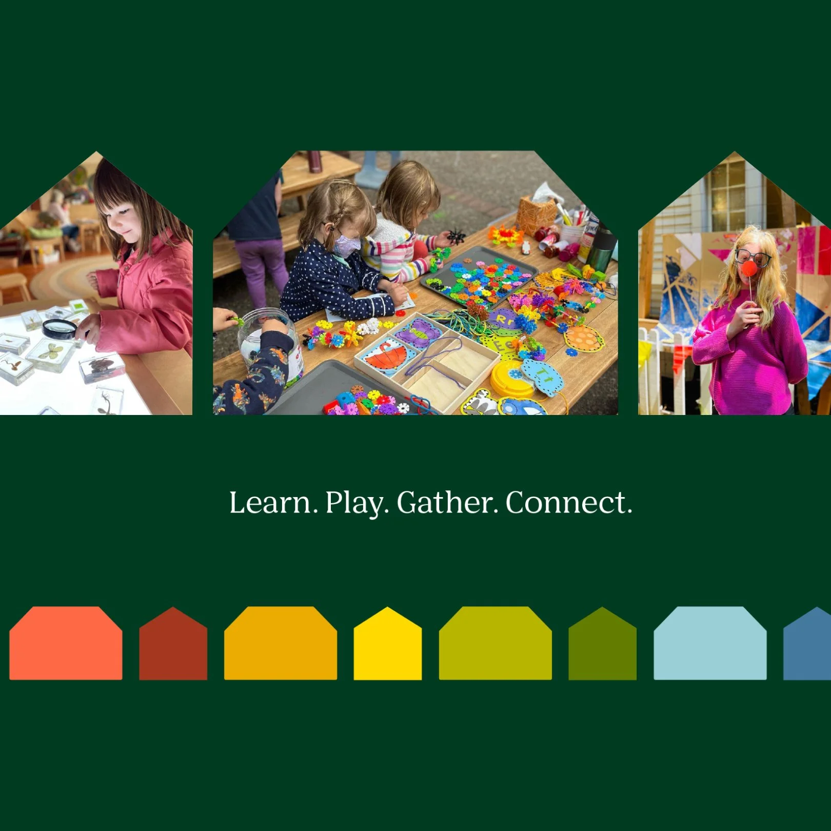
A brand system designed to celebrate the coming together of diverse ages, identities, and interests to learn, play, gather, and connect—all under one roof.
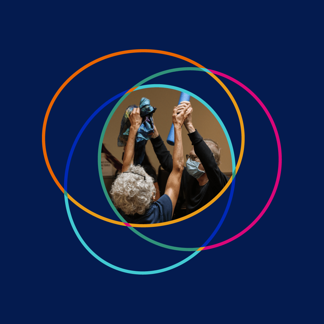
A brand that celebrates the ways we intersect and connect, with a focus on the people at the center of it all—where the true magic of community happens.
Our brand for Amherst Oyster Bar welcomes guests to dine by honoring classic East Coast seafood and celebrating the lore of the oyster with fresh new energy.
The Bistro Agnes brand takes inspiration from historic French lettering found on street signs and in print to evoke a sense of nostalgia and delight.
Since 2014, we’ve worked with Weston Table to define every expression of their brand, and build their Shopify Plus marketplace of over ten thousand products.
We partnered with JHID to create a brand that allows their award-winning work to shine in a full-screen sensory world of texture, color, and tactility.
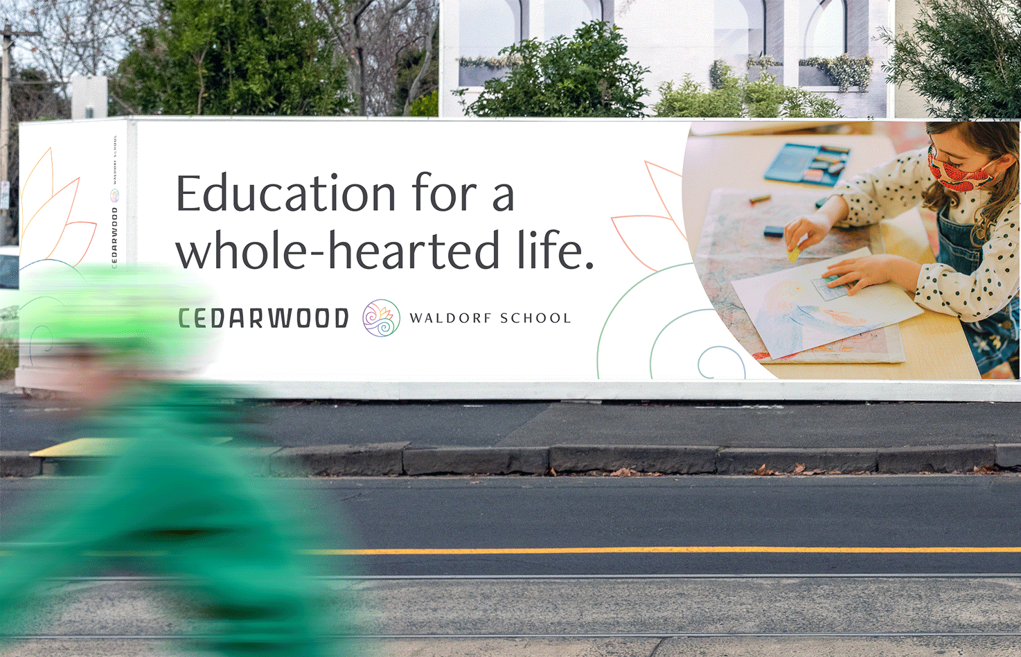
We worked with the Cedarwood team to reflect their innovative approach to Anthroposophy in a brand that is recognizably Waldorf and unmistakably evolved.
Joyful’s inspired optimism is their natural and defining differentiator among competitors, and it's also the guiding driver for their visual brand design.
In our campaign for the London Women’s Clinic, a flexible and adaptable icon system becomes a visual storytelling tool for conveying the benefits of egg freezing.
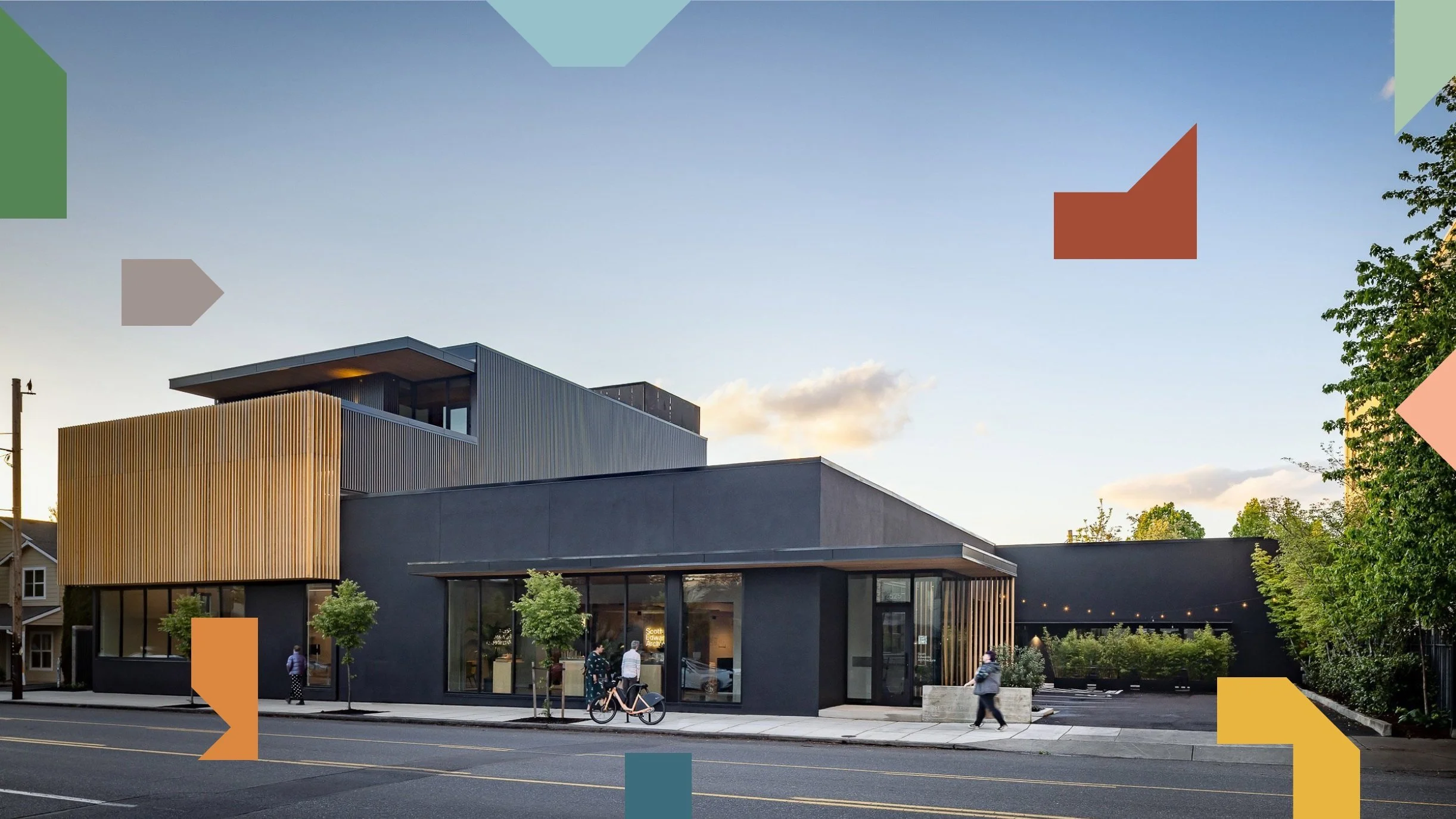
Our strategy for the SEA brand focused on defining and celebrating their differentiators, and clarifying their driving ethos, “People First, Design Forward.”
Inspired by the idea of the weeknight as a daring time to sneak out and have a good time, our brand concept grants permission to have fun on a School Night.
We designed a logomark, messaging, and website that mirrors Gould's unique ethics-driven values, human-centered services, and expertise in Behavioral Finance.
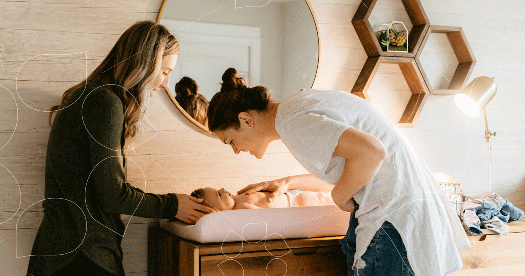
Bringing leading-edge technology and unmatched compassion to donor sperm services with a cryobank brand that speaks to science and humanity in equal measure.
The London Egg Bank's visual brand refresh and website design focuses on a user experience to serve their diverse audience of recipients, freezers, and donors.
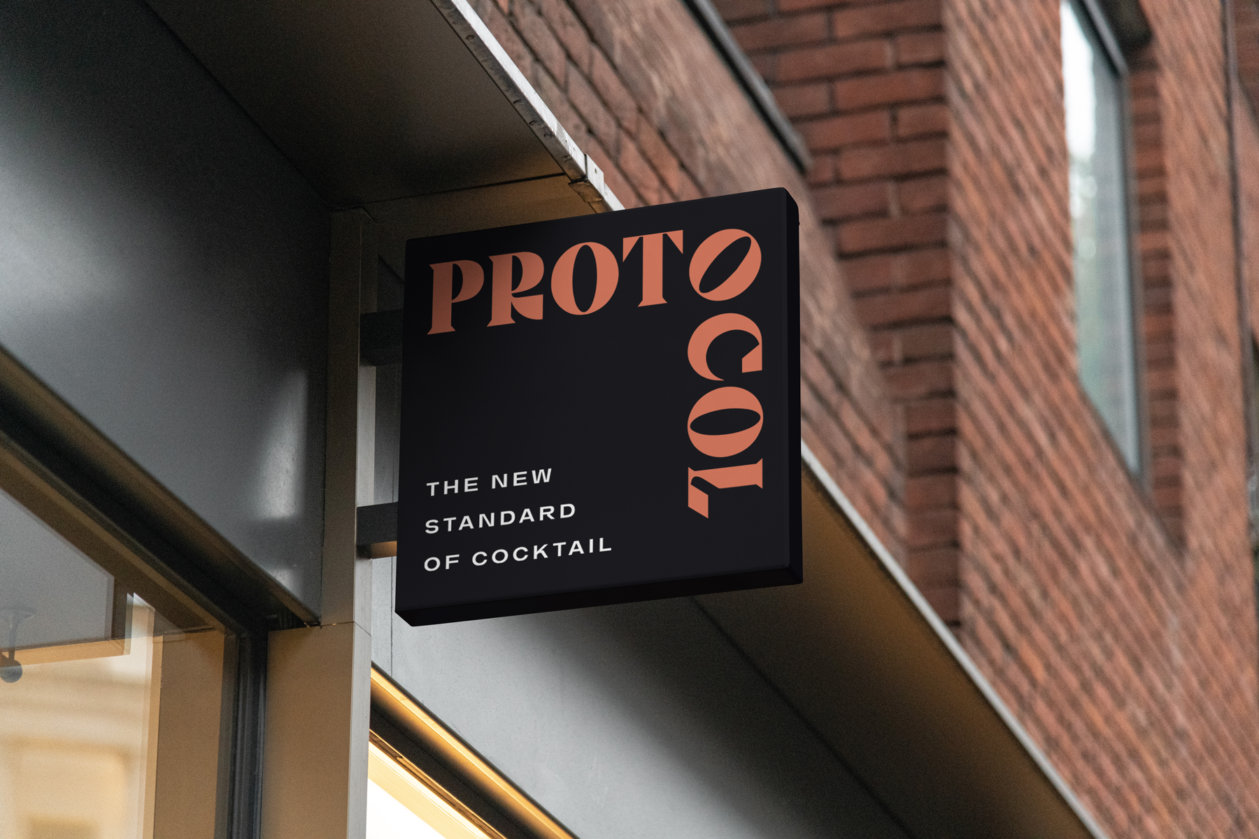
We brought bold artwork and enticing typography to the front of this bar brand, to create an immersive experience that's fit for a new standard of cocktail.
We translated Surgo's values and mission into a brand that captures expert innovation, data-focused research, and brilliant change-making at the highest level.
Iconography alludes to the era of Tesla and Edison in a residential brand uniting the past and future of Amherst’s most sustainable address to call home.
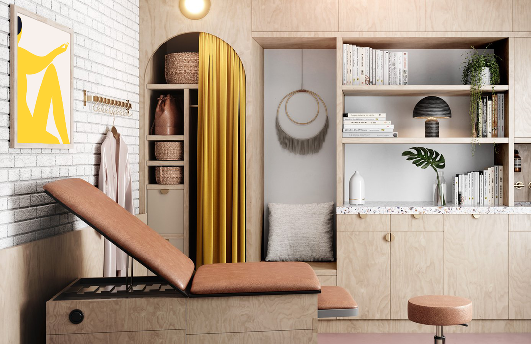
We worked with Kindbody to design a patient portal app experience that’s inclusive to all ages and genders—no matter where they are on their fertility journey.
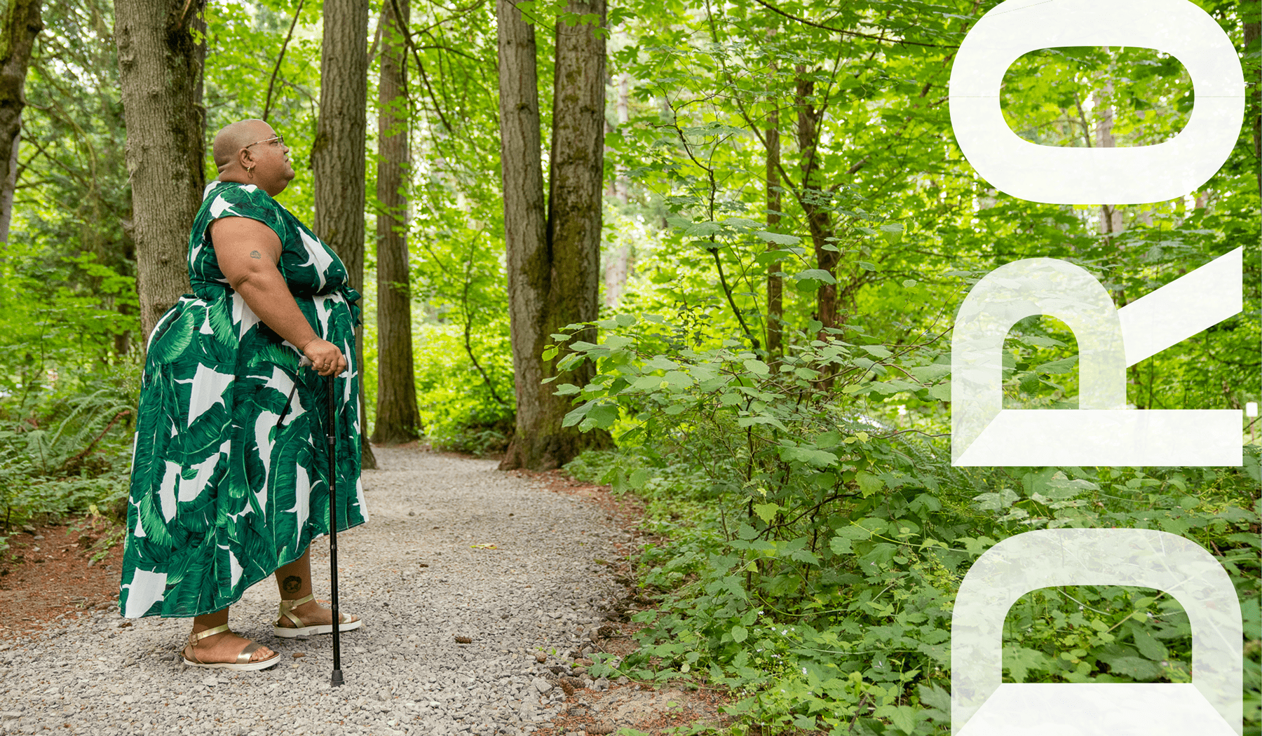
Establishing a new standard of uncompromised accessibility for Disability Rights Oregon with an updated, inclusive brand and feature-rich ADA-compliant website.
With keen attention on improved accessibility and ease-of-use for all, we worked with Hacienda’s leadership team to design a website that puts community first.
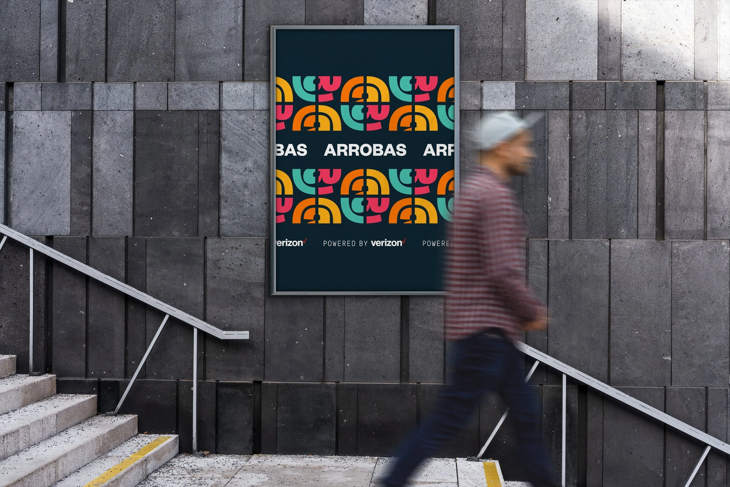
With a vision of connection for all, our brand for Arrobas signals the coming together of different elements—resources, people, communities, and more.
Bringing humanity forward in an illustration-rich brand world to create a interactive hub for health, wellness, and nutrition, where science meets your story.


